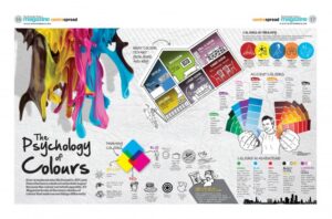
If planned right, the correct choices can maximize productivity, enhance employee creativity and even reduce stress and fatigue. There are certain physiological changes that occur in humans, when exposed to certain colors.
Over the next couple years, we’ll see unexpected color combinations surfacing everywhere in home décor and businesses – on walls, furniture and accessories.
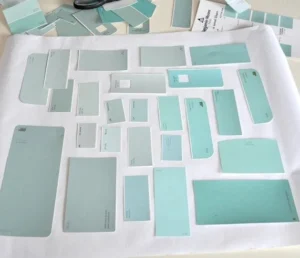
What colors we choose to mix is all subjective. Even though we’re all different individuals with different likings, no matter what colors we choose to mix, they tend to nourish the senses and feast the eye, merging shades that are alive, yet calming.
Mixing colors accurately may be an art unto itself. Nonetheless, there are many tools available to help one get the right color. Most businesses can match the color of one’s choice to the tee nowadays.
There is a lot of scientific research recognizing that there is a distinct relationship between color, mood and behavior. For instance, when grey skies and rain surround us, what do we do? That’s right, we tend to draw in. Bright blue skies, a colorful garden, flowers and even green forests though, have the opposite effect.
Cultural influences, our beliefs and our upbringing also have an effect on the way we see color. There are other reasons, not limited to perception, that color choice in an office or home environment is important. For example, the color of a room affects our perception of the temperature. There are tests that claim that people estimate the temperature of a room with cool colors, such as blues and greens, to be 6-10 degrees Fahrenheit cooler than the actual temperature. Warm colors, such as reds and oranges, will result in a 6-10 degrees Fahrenheit warmer estimate.
One thing to remember besides the perception of the temperature, there are energy savings to be realized by using the right colors. Dark colors absorb more light and reflect less. Light colors absorb less and reflect more. As a result it is energy-wise to use light colors on the main walls with the ceilings to be white or off white.
Here is a basic guideline of the different moods color can create:
- Pinks = emotional, sensitive
- Greens = full of life, fresh, honest
- Yellow = happy, bright, warm
- Browns = comfortable, dependable
- Teal, turquoise = cool, constant
- Grey, charcoal = cool, distant, neutral
- Earth tones = warm, friendly
- Oranges, peaches = inviting
- Red = passionate, emotional, aggressive
- Purples, violets = sophisticated, fashionable
- Blues = tranquil, soothing, harmonious
So, expect the unexpected in trendy homes, and commercial interiors and exteriors with mixed colors